
Color is an essential element of product photography: it helps identify the brand, conveys material quality and allows references to be compared without surprises. An image can be well lit and still display a different tone than the actual product if the white balance, color profile or screen are not controlled.
This guide provides a practical method for maintaining color fidelity from sample preparation to file delivery. The goal is not that every image is identical, but that each product retains its true appearance and the catalog maintains a professional consistency.
Contents
Why It Matters to Show Accurate Color
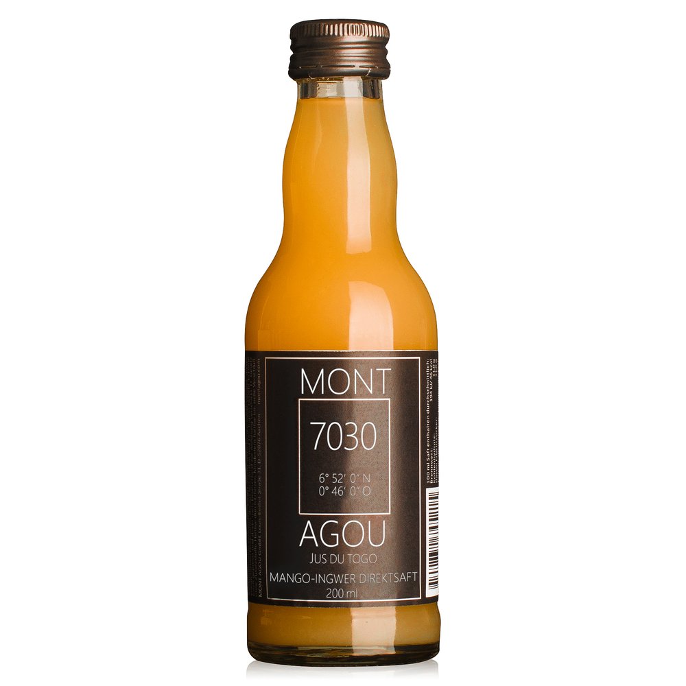
Buyers make quick decisions based on the image. If a bottle looks more yellow, a fabric loses its hue or a metal accessory changes tone, expectations won't match what arrives at home. The result can be a return, a negative review, or a catalog that appears inconsistent.
Fidelity doesn't mean removing all personality from the photograph. You can work with contrast, depth and an attractive composition as long as the main color, proportions and texture remain recognizable. To achieve this, you must control the entire scene, not just the camera.
White balance and color temperature
White balance compensates for the color cast of the light source. A too-warm temperature makes whites look yellow; a too-cool temperature makes them appear bluish. In product photography, it's best to set white balance manually and keep it consistent throughout the entire series.
- Avoid automatic white balance when comparing multiple product references.
- Work with a stable light source and do not mix window light with fixtures of a different color temperature.
- Take a control shot at the start and after any change in lighting.
- Check whites, greys and skin tones, because they quickly reveal a color cast.
Light, surface and reflections
The color we perceive also depends on the light that bounces off the surroundings. A colored background, a wooden table or a nearby sheet of card can tint a light surface. For polished objects, reflections occupy a large part of the image and can change the perception of the material.
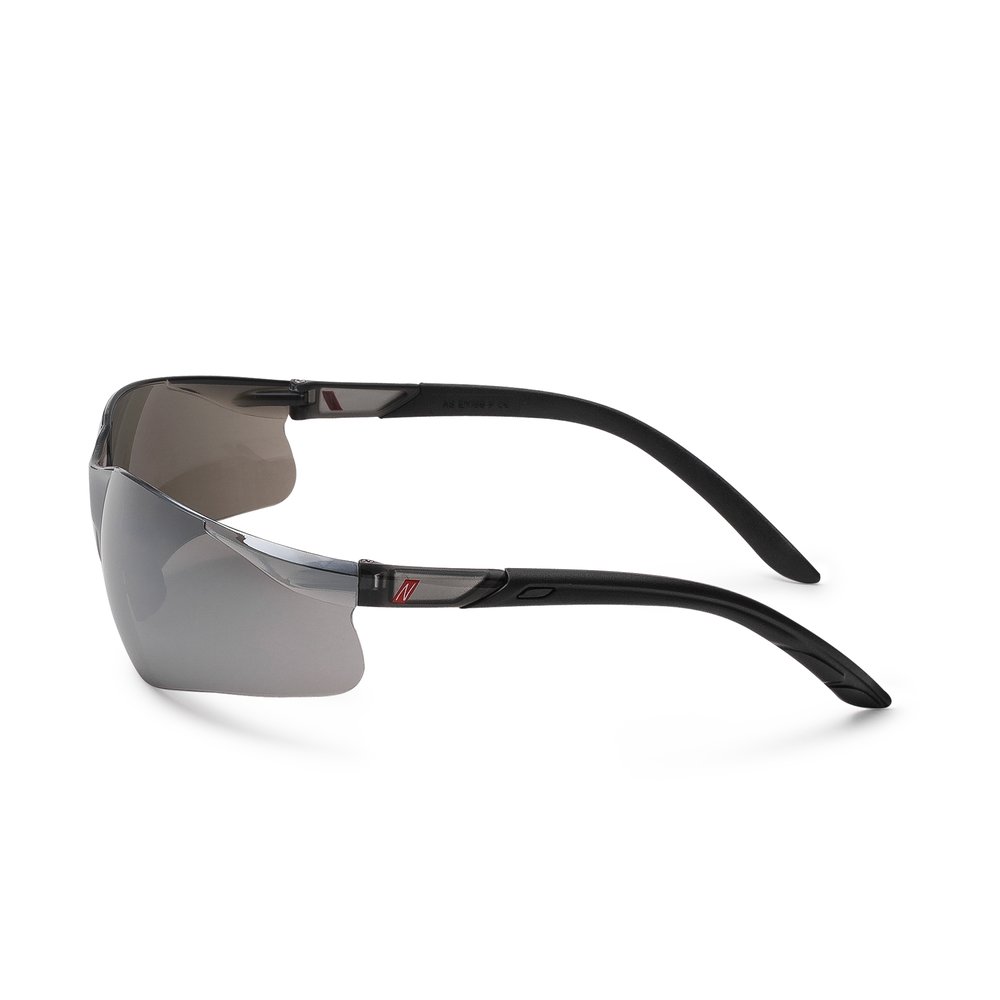
Use neutral backgrounds when the priority is to describe the product. For reflective surfaces, position flags and diffusers outside the frame to control what is reflected. This preserves volume without introducing colored patches that are difficult to correct afterwards.
Color charts and references
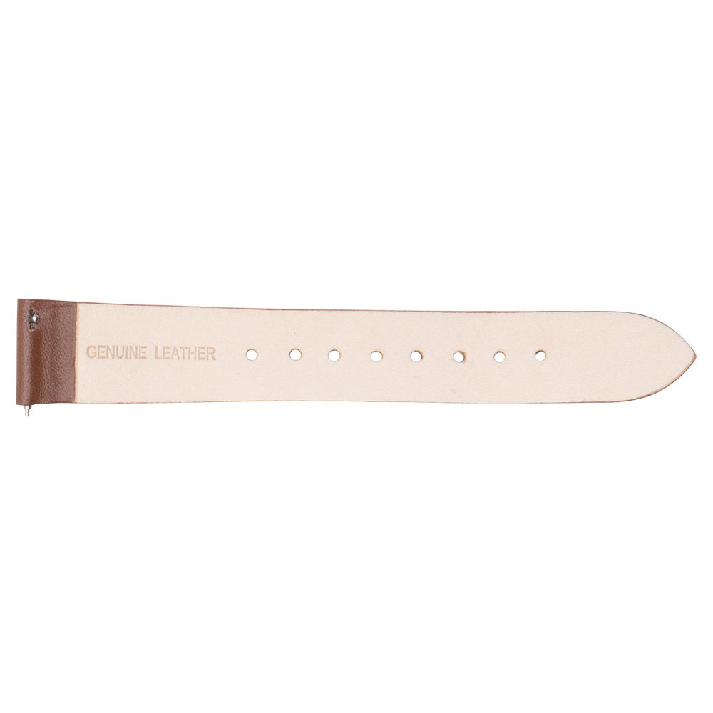
A color chart or an approved physical sample serves as an objective reference. It is photographed under the final lighting conditions and helps calibrate capture and post-processing. If the client has a corporate color, be sure to provide the brand code or send a physical sample, because a screen photo does not always represent the exact shade.
Key point: The color reference should accompany the briefing. A name like “dark blue” can be interpreted in various ways; a physical sample or a specific code removes that ambiguity.
Profiles and file formats
During editing, the color profile defines how image values are interpreted. For web and marketplaces, sRGB is commonly used because it is the most compatible space for browsers and devices. If the project requires print or advanced color management, agree on the delivery profile before exporting.
- Keep a master file containing the maximum available information.
- Export high-quality JPEGs for ecommerce listings, unless the channel requires another format.
- Ensure the ICC profile is embedded when saving the final file.
- Avoid multiple profile conversions: each conversion can alter tones.

Retouching faithful to the product
Retouching should remove dust, minor wrinkles or accidental reflections without inventing a finish the product does not have. Adjusting exposure and contrast is reasonable; changing the color of a garment, oversaturating a label or removing a characteristic texture can create a misleading expectation.
When a reference requires a specific color correction, keep a comparison version and validate the result with the client. This review is especially important for cosmetics, food products, fashion and products whose sale depends on a specific shade.
How to maintain a consistent catalogue
Consistency is achieved by shooting the series under the same conditions: camera, distance, background, light direction and processing settings. If a collection is produced over multiple sessions, save a reference image and repeat the position of the main light source.
- Use the same color chart or control sample in each session.
- Compare the first images from a session with those previously approved.
- Review thumbnails collectively, not just each file separately.
- Document changes to lighting, camera settings and color profile.

Checklist and Frequently Asked Questions
- Is the light source stable and free of color casts?
- Is the white balance set and documented?
- Is there an approved physical sample or color code?
- Is the monitor calibrated for reviewing edits?
- Does the final file have the requested profile and format?
- Does the entire series maintain the same appearance?
Is checking color on a mobile device sufficient? No. Screens have different settings, profiles and brightness levels. A mobile device is useful for a quick review, but final approval should be done on a calibrated display and with a physical reference when tone is critical.
Can any color be corrected in post-production? Many deviations can be adjusted, but it is not advisable to use retouching to compensate for poorly planned lighting or an incorrect sample. A controlled capture always delivers a more natural and repeatable result.

If you need product images with true-to-life color and a consistent aesthetic, send us your references, samples and publishing channels. We will prepare a proposal outlining the workflow, shots and formats suitable for your catalog.