
The question may seem simple, but there is no magic number that fits every product. A product page needs enough images to explain the item, resolve doubts and build trust without filling the gallery with duplicates. This guide provides a practical method to decide how many photos each product reference needs and what each one should show.
Contents
How many photos does a product need?
As a starting point, a product page usually performs best with between five and eight clearly differentiated images. The first presents the product, the following images explain its shape, details and use, and the last can help convey scale, contents or dimensions. It’s not about hitting a number for its own sake: it’s about answering the questions that arise before purchase.
A simple product, such as a bottle or a small accessory, can be fully explained with five photographs. A garment, a flat-pack piece of furniture or an item with several components will need more views. If two images show exactly the same thing, adding them doesn’t improve the listing; if an important detail is missing, even ten photos may be insufficient.
The final decision should take into account the sales channel, product complexity, common customer questions and the space available for the gallery. Quantity matters, but sequence and visual coherence matter even more.
Minimum essentials for a clear product page
For most ecommerce products, we recommend organizing a base of six images:
- Main view: the full product, clean and recognizable.
- Alternate view: an angle that shows shape and volume.
- Functional detail: closure, texture, connection, label or finish.
- In-use view: the product in context or showing its scale.
- Contents and dimensions: included parts, measurements, or assembly system.
- Trust-building image: a final shot that highlights materials, quality or the result.
This structure is a framework, not a rigid template. In a catalog with many variants it can be more efficient to produce four master views and adapt only the specific image for each product reference. However, when design or function varies between models, each variant needs its own gallery.
The main image determines the first click
The first image should allow the product to be recognised at a glance, even when it appears as a thumbnail in search results. Use clean framing, consistent lighting and sufficient space so the item doesn’t get lost on small screens. If the marketplace requires a white background, prepare that view with the background and aspect ratio specified by the category.
Avoid placing promotional text, overlaid logos, badges, accessories not included in the pack, or decorative elements that may confuse the offer on the main image. The photograph should answer a very specific question: "What will I receive if I buy this product?".
On your own e‑commerce site there is more freedom to use a lifestyle cover image, but it is still advisable that the second or third image be a technical view. The buyer should be able to compare the attractive image with a faithful representation of the real product.
What each view should show
A useful gallery is built as a brief visual explanation. Before photographing, write down the questions the sales team would receive: What does it look like from the back? What size is it? What parts are included? How does it open? What is the texture? How does it look when used? Each question should have a visible answer.
- Use different angles, not six nearly identical shots.
- Focus on the areas that justify the purchase: materials, seams, controls, or finishes.
- Include a view that helps convey scale without introducing misleading objects.
- Show the complete contents of the package when the offer includes multiple pieces.
- Maintain the same color temperature, background and light direction throughout the sequence.
Detail images should be close enough to be useful, without losing context. A close‑up of a buckle makes sense if it is also clear where it is located on the product. The gallery should progress from general to specific and finish with an image that confirms the purchase decision.
Products that require more photographs
Some items raise more questions because they require assembly, have multiple functions, or include differences that are hard to explain in a single view. In these cases, expanding the gallery makes sense if each photograph serves a specific purpose.
- Fashion: include front, back, fabric detail, drape and a reference for fit or scale.
- Furniture: show volume, measurements, joints, interior and the assembled product.
- Electronics: photograph connections, controls, included accessories and charging ports.
- Cosmetics: show the packaging, texture, applicator and actual size.
- Food: display the packaging, label, quantity and a view that clarifies the serving size.
- Home decor: combine a clean shot with a scene that helps visualize the product in a space.
When the product is complex, a simple infographic can complement the photography. The image should remain clear and honest: measurements, arrows or callouts must not hide details or replace the views the buyer needs.
Category and channel affect the number
Amazon, specialized marketplaces and owned stores do not display galleries in the same way. Some categories have rules for the main image, others allow lifestyle scenes and some require showing specific information. Before deciding the final number, review the channel’s technical specifications and check how the gallery is displayed on mobile.
On a marketplace, the first images must be self-sufficient because users compare multiple offers quickly. On your own store you can expand the explanation with video, zoom or rich content modules. That doesn't mean you need fewer images: it means you can better distribute information across formats.
If you sell the same product across multiple channels, create a master file and export adapted versions. Maintain a common sequence so the brand is recognizable, but reserve one or two additional images to meet the rules and needs of each platform.
More photos don't always mean higher conversion.
The gallery helps sell when it reduces uncertainty. A repeated, blurry or inconsistent photograph can have the opposite effect: the customer doubts the quality or doesn't understand which is the correct version. That's why a sequence of six informative images is preferable to a gallery of twelve almost identical photos.
- Arrange the images according to the buyer's mental journey.
- Present early the detail that sets your product apart from the competition.
- Use a usage scene only when it helps to communicate scale or benefit.
- Avoid changing the background, crop, or color temperature without a valid reason.
- Check the gallery on mobile: thumbnails and small text change how it's viewed.
Also monitor the questions and returns that arrive after publishing. If many people ask about a measurement, an accessory, or the package contents, that information deserves its own photograph. The gallery can improve over time based on real data, not just aesthetic preferences.
Examples of a well-designed gallery
These portfolio images show different categories. The idea is not to copy a specific sequence, but to observe how the necessary information changes when the product changes.
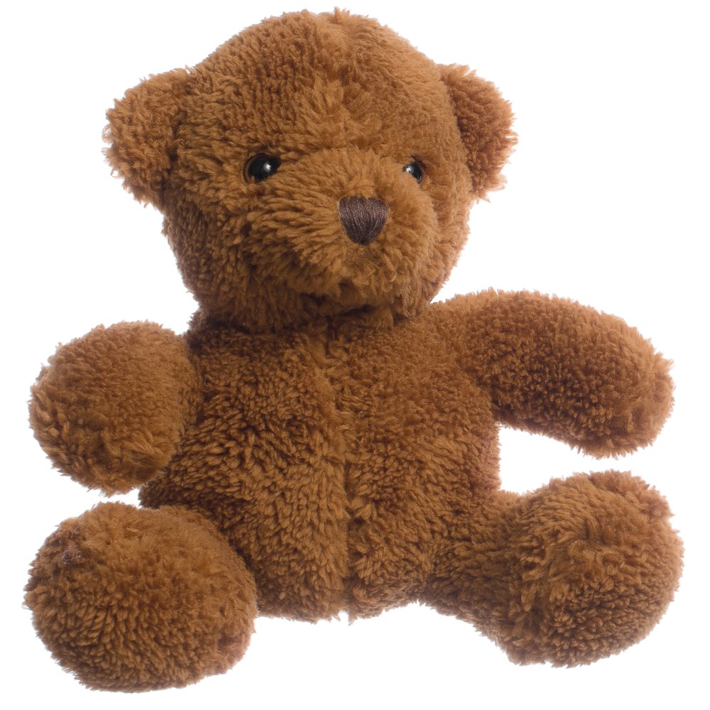
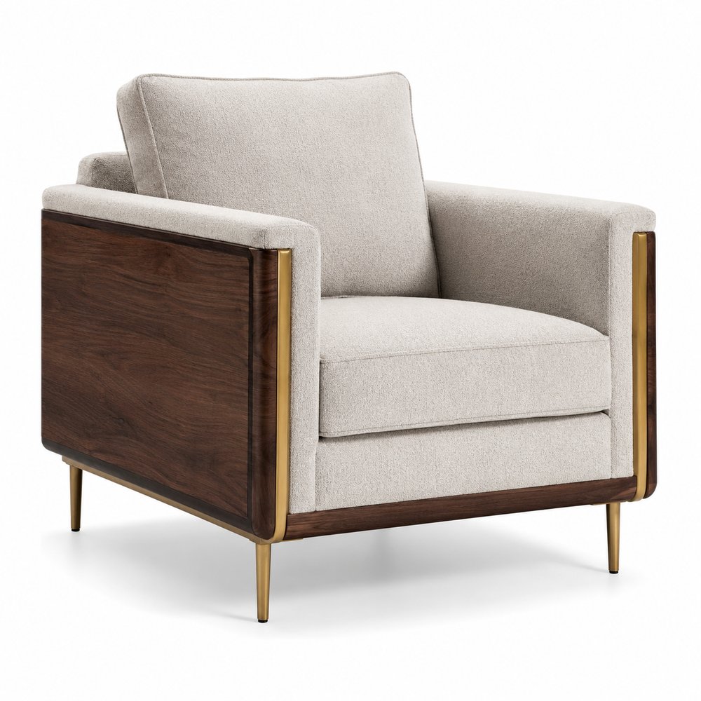
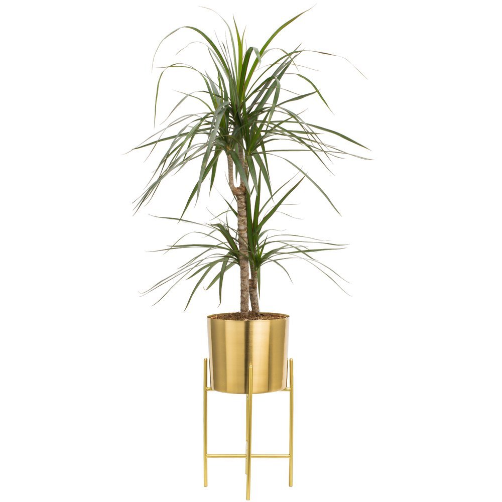
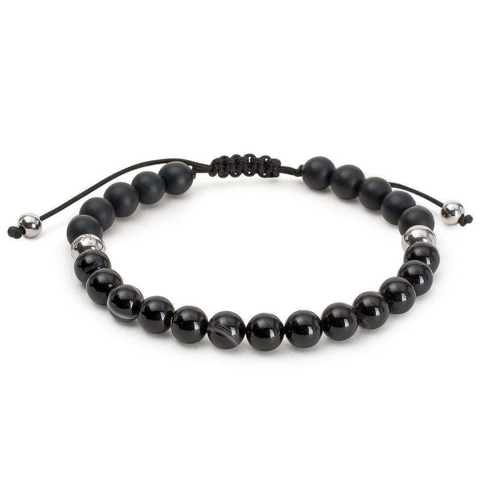
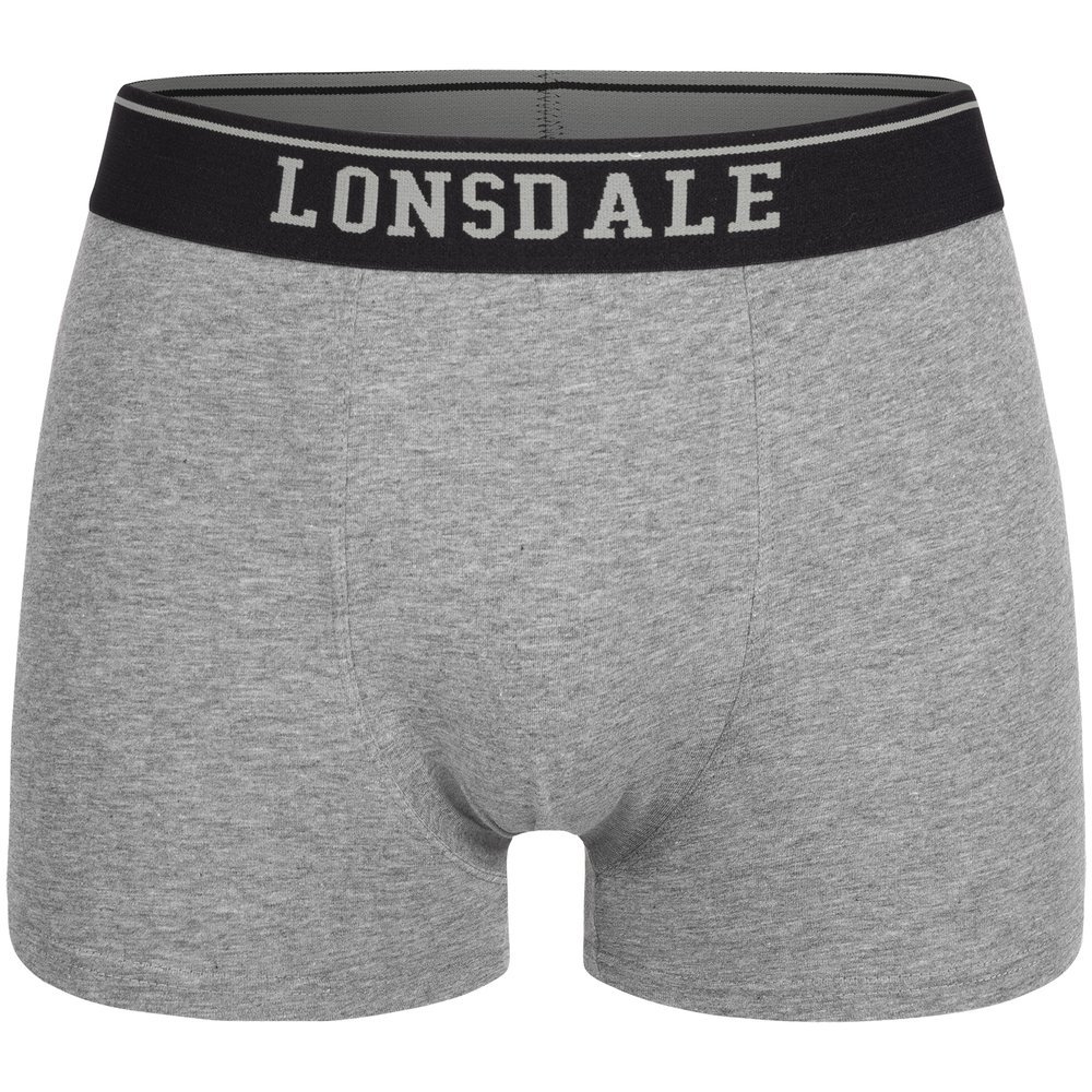

For a product collection, the best approach is typically to combine a common base of views with specific photos that clarify the differences between SKUs.
How to plan the shoot without taking unnecessary photos
Start with a simple table listing the SKU, the variant, the required views and the publishing channel. Mark which are mandatory and which will only be produced if they provide new information. This way you avoid discovering during editing that the back of a garment or a fastening detail is missing.
- Collect product references, measurements, permitted claims and examples from competitors.
- Define a shot list before placing the first product.
- Photograph a complete SKU first to establish lighting, scale and color.
- Review the shots on a large screen and discard duplicates immediately.
- Save file names and variant names consistently.
A clear brief reduces studio time and makes cost estimation easier. It also allows production to be repeated for a new variant without changing the appearance of the entire catalogue.
How to calculate the budget based on the number of photos
The price does not depend only on how many final files you receive. Preparation, the type of lighting, styling, the complexity of retouching, product changes and adaptations for each channel also influence the cost.
At Epic Studio we work with concrete references and requirements. As a guideline, our rates start at €6 per footwear or model photograph, €8 for accessories, €9 for Hollow Man, €10 for Flat Lay and €2 per image with AI assistance. The final quote is confirmed after reviewing the brief, the number of references and the required views.
For example, a simple product with six photographs can be faster to produce than a garment that requires ten views, ironing, styling changes and texture retouching. Requesting a quote with the shot list helps compare proposals fairly.
Checklist before publishing the gallery
- Does the first image allow the product to be identified at a small size?
- Does each photo answer a different question?
- Are the contents, details and key dimensions visible?
- Do the variants have the correct color, scale and accessories?
- Are lighting, background and retouching consistent across the entire sequence?
- Is the gallery clear on mobile and on the chosen marketplace?
- Have duplicates and shots that add no information been removed?
Frequently asked questions
Is it better to publish five or ten photos?
It's best to publish all views that provide useful information and remove duplicates. For many products, five or six well‑chosen images cover the essentials; complex items may require more.
Should I photograph each color?
If color, pattern or finish affects the purchase decision, yes. Keep the same position and lighting so variants can be easily compared.
Do lifestyle photos replace technical shots?
No. A lifestyle scene helps imagine use, but it should be complemented with clean views that show shape, details, size and contents.
When is it appropriate to add video?
Add video when movement, assembly or operation are difficult to explain with still images. Video expands the information but does not replace an organized gallery.
Can I reuse the same photos across multiple channels?
You can base assets on the same master file, but review proportions, background, allowed text and the sequence of images for each channel. Proper adaptation prevents rejections and enhances the shopping experience.
Conclusion
The appropriate number of photographs is the one that enables buyers to purchase with confidence. Start with a clear main view, add angles and details that answer real questions, and remove anything that only repeats information. A coherent gallery of six images can sell better than a disorganized collection of fifteen.