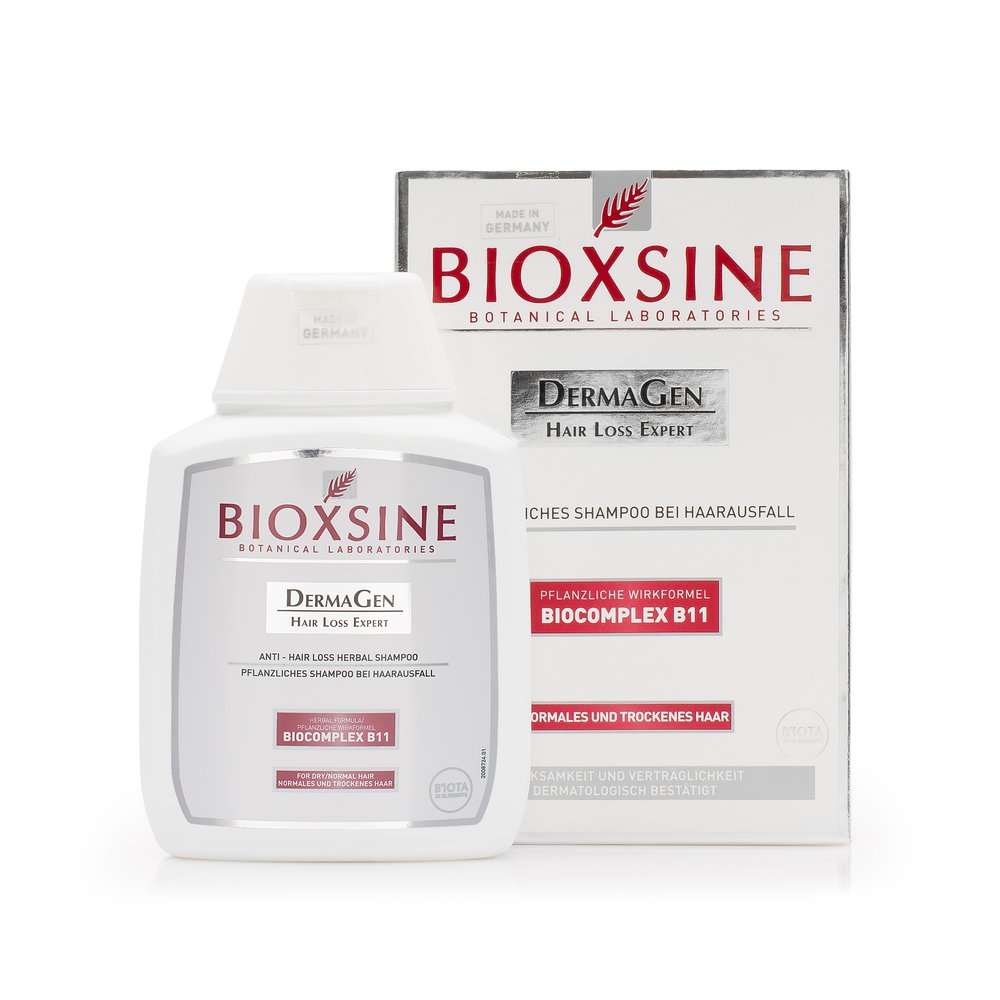
In cosmetics, a photograph must accomplish three goals simultaneously: clearly show the product, convey its texture, and preserve true color. An attractive package is not enough if a cream’s shade shifts, a highlight obscures the label, or the finish looks different upon receipt. This guide presents a practical method to plan lighting, framing, and retouching for beauty products intended for ecommerce, marketplaces, and catalogs.
Contents
What a cosmetics photograph should communicate
The primary image should enable recognition of the product’s format, name and quantity within a few seconds. A secondary view can illustrate the texture, the applicator, the opening or the scale. First determine which question each photograph should answer, and avoid trying to show all the information in a single shot.
Maintain consistent distance and proportion between shots. If a brand sells serums, creams and cleansers, the buyer should be able to compare the range without each package appearing photographed with a different aesthetic.
How to light the packaging
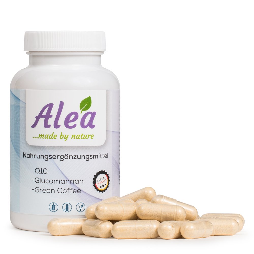
Start with a large, diffused light positioned to the side. This light creates a soft gradient on round bottles and keeps the label readable. For boxes and straight-edged containers, add a second, tightly controlled light or a white reflector to lift the shadows without erasing the edges.
Matte plastic, glass and metallic finishes respond differently. Test by positioning the light farther away and gradually bringing it closer until you find a clean transition. Lighting should describe the volume, not create a white glare that covers the logo or the ingredient list.
Texture, density and finish
Texture is part of the buying argument. A dense cream, a fluid serum, a balm or a compact powder need lighting that reveals their surface. Use a low side light to emphasize relief and a support card to control contrast at the edge.
If you show the product open, prepare a clean portion and repeat the gesture across all variants. Avoid bubbles, fingerprints and tool marks that do not belong to the product. In a commercial series, the texture should look natural and repeatable, not improvised.
Accurate color and white balance
In makeup and facial care, a color cast can change the purchase decision. Before shooting, calibrate the camera and place a neutral reference in the first shot. Maintain the same color temperature across the entire collection and review the results on a calibrated monitor.
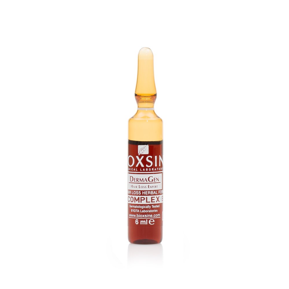
Don't correct color by looking only at the background. Check the product, the label and the white areas of the packaging. If the material is translucent, also check the contents and the tone of the shadows, since both can alter how the final color is perceived.
How to control highlights and reflections
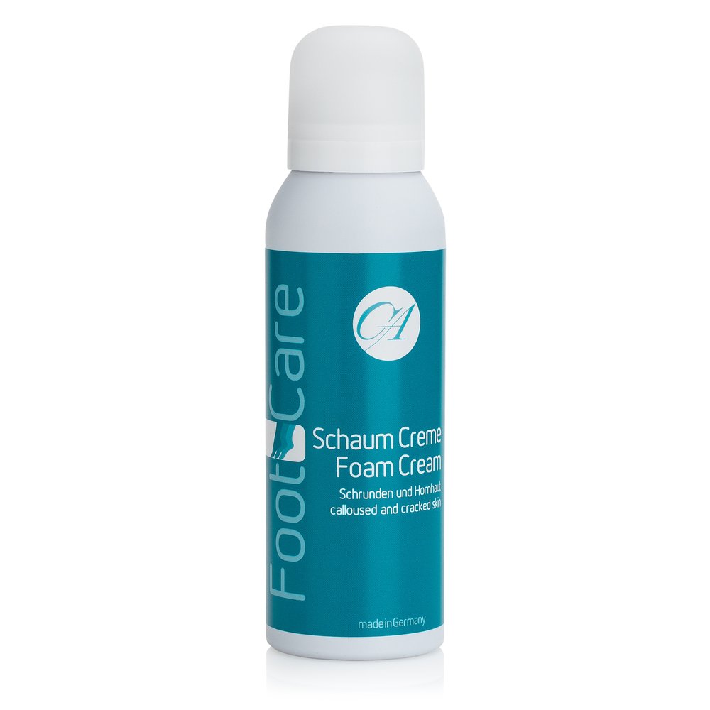
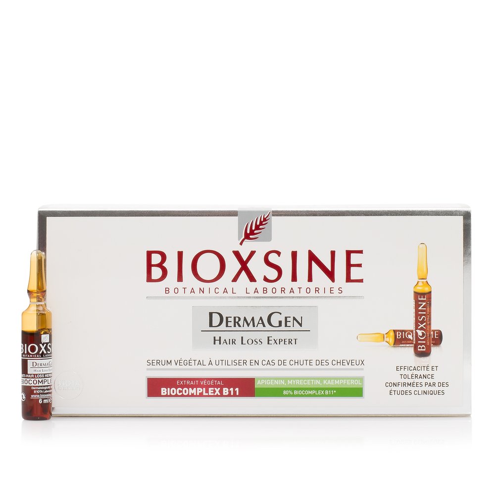
Lacquered, metallic and transparent packaging reflects the studio. Place large diffusers outside the frame to create soft bands and use black flags when you need to shape the outline. Change the position of the light source first and only then its power: direction usually influences the result more than intensity.
Leave an area of highlight that confirms the material is glossy. The aim is not to eliminate it, but to prevent it from crossing text, blowing out the color, or obscuring the shape of the cap.
Composition and brand style
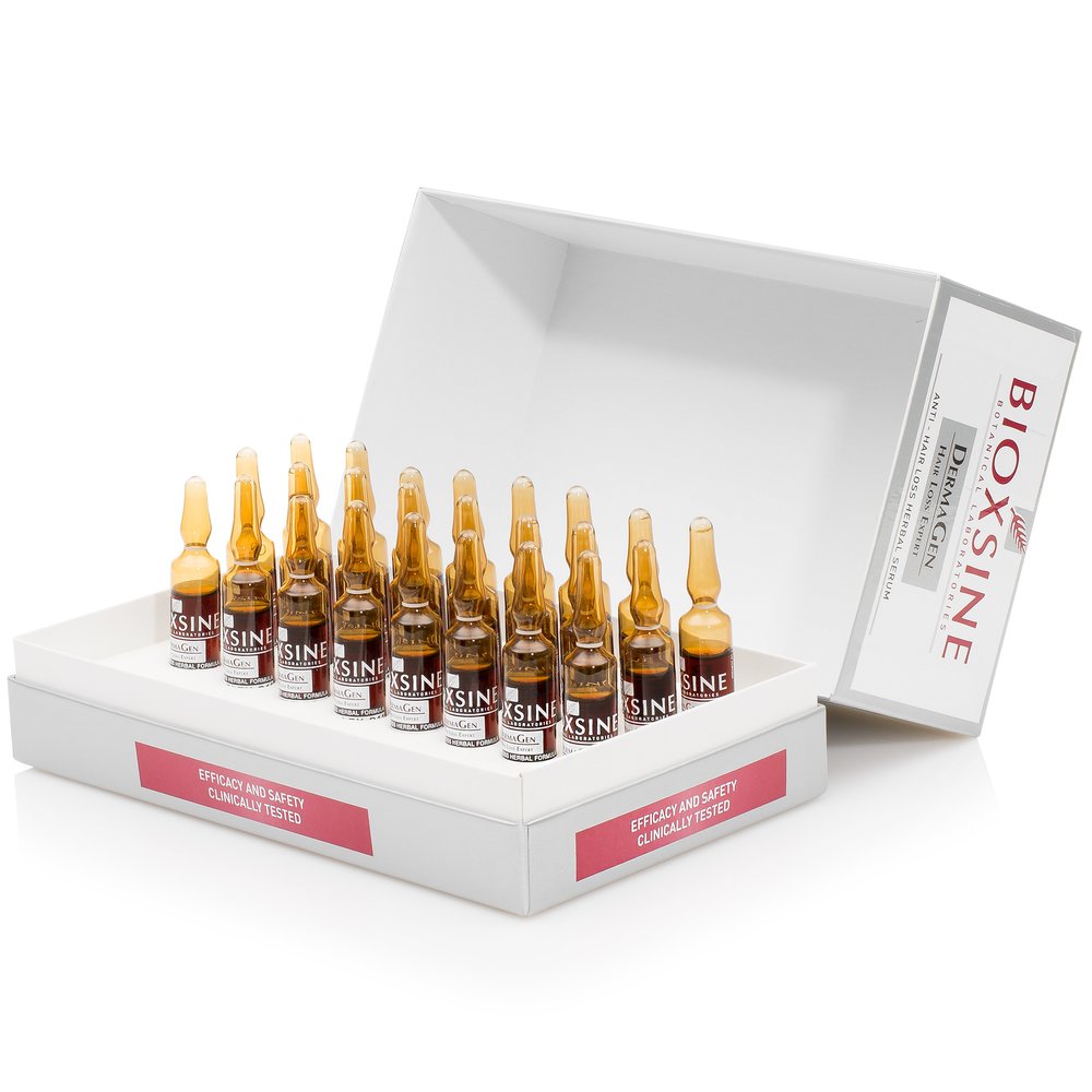
A catalogue photograph and a campaign image serve different purposes. For catalogue shots, prioritize background, scale and product legibility. In a lifestyle scene you can add texture, color or ingredients, but the packaging must remain identifiable and not get lost among decorative elements.
Define a palette of backgrounds and props before you start. Repeat margins, camera height and shadow direction so the entire collection reads as a single brand, even when the size or format of the packaging varies.
Common mistakes
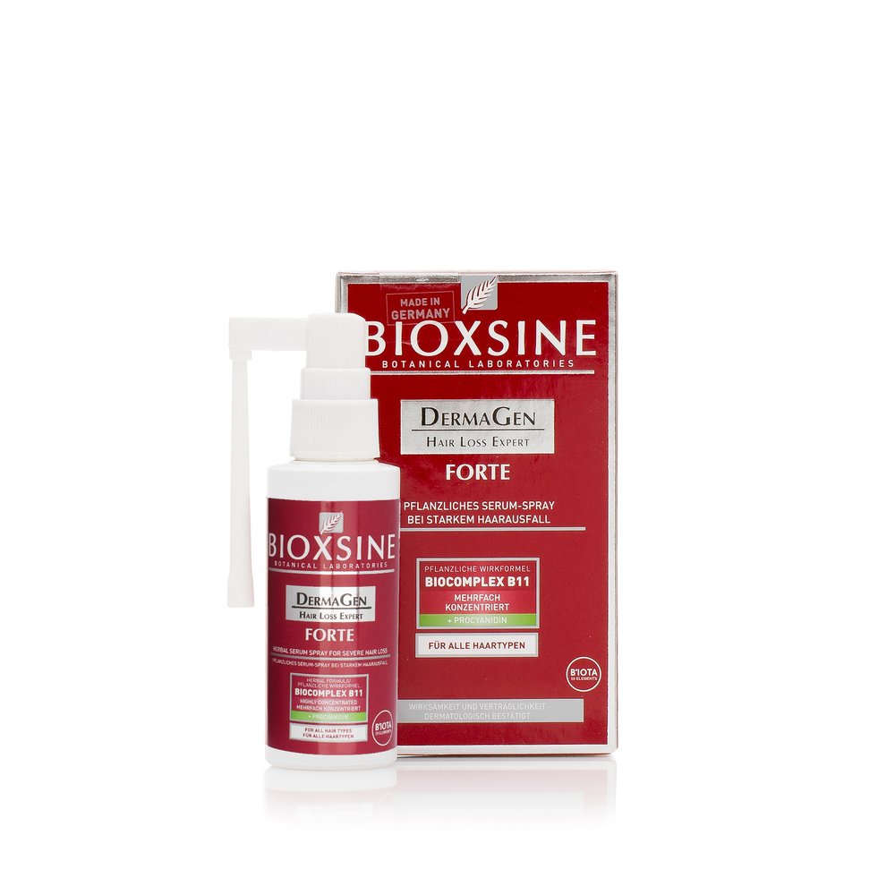
The most frequent errors are shooting with overly frontal lighting, cropping the contact shadow, using a different white balance for each product reference and leaving dust or fingerprints on the packaging. Information is also lost when the label curves, the text appears in perspective or the cap is misaligned.
Before repeating the shoot, inspect one image at 100%. If color, texture and scale are correctly resolved in one reference, use that shot as a guide for the rest of the collection.
Retouching and file preparation
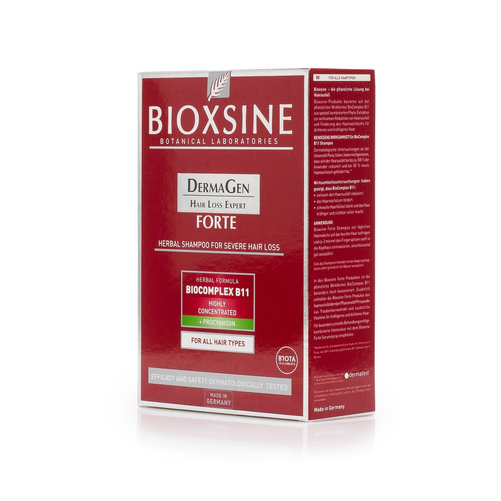
Retouching should clean, match and prepare the photograph for its channel, not invent a new texture. Remove dust, accidental scratches and background inconsistencies, but preserve pores, pigments and highlights that describe the product. If a label requires correction, work with a mask so as not to affect the volume.
Deliver a master image and versions adapted for the online store, marketplace and social media. Check the color profile, file size and sharpness at actual size. Also keep an editable copy for future variants or packaging changes.
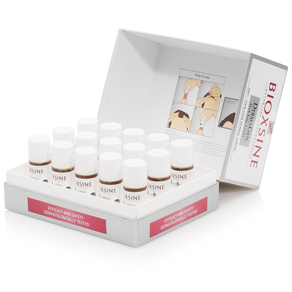
Checklist and Frequently Asked Questions
Checklist: clean the container; confirm the order of variants; calibrate camera and monitor; prepare a large light source; control reflections; photograph a color reference; check text and edges at 100%; export a master version and copies for each channel.
Is it necessary to show the product open? Only if the texture, applicator, or quantity help the purchase decision. It can be a secondary image, not necessarily the main one.
How do you photograph a metallic container? With large light sources, diffusers and flags that create broad reflections. The light position should be adapted to each curve and finish.
What should the brand send to the studio? Clean, complete products, color references, channel instructions, order of variants and examples of the visual style the brand wants to maintain.